
2022 - 2025
Vision Street Wear
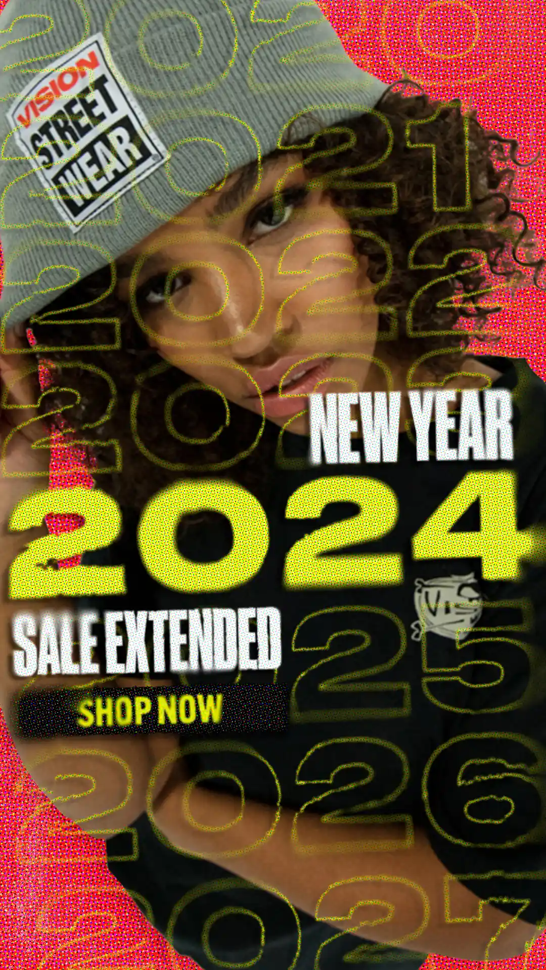
Vision Street Wear is a heritage skateboarding brand known for its bold graphics, raw energy, and deep roots in ‘80s and ‘90s street culture. When I joined, the brand lacked a unified visual identity, struggling to stand apart in an oversaturated market.
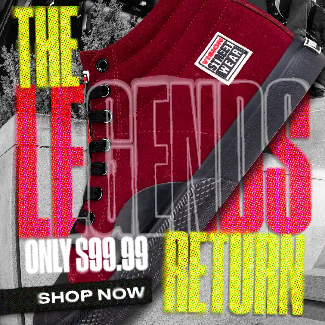
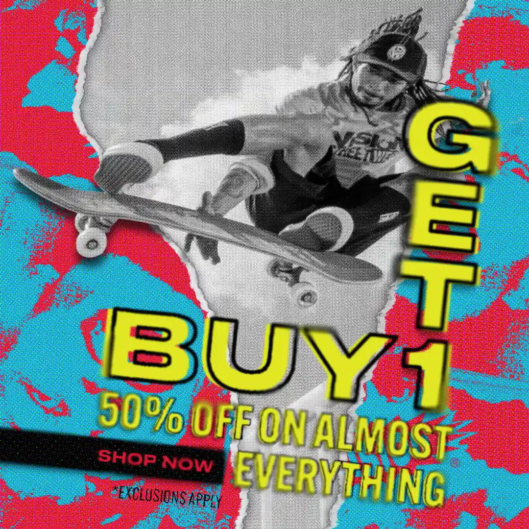
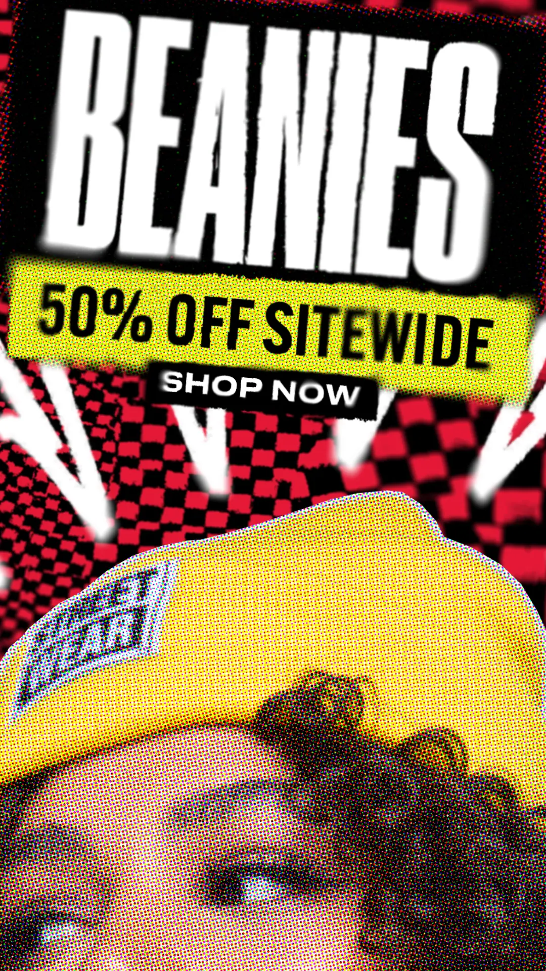
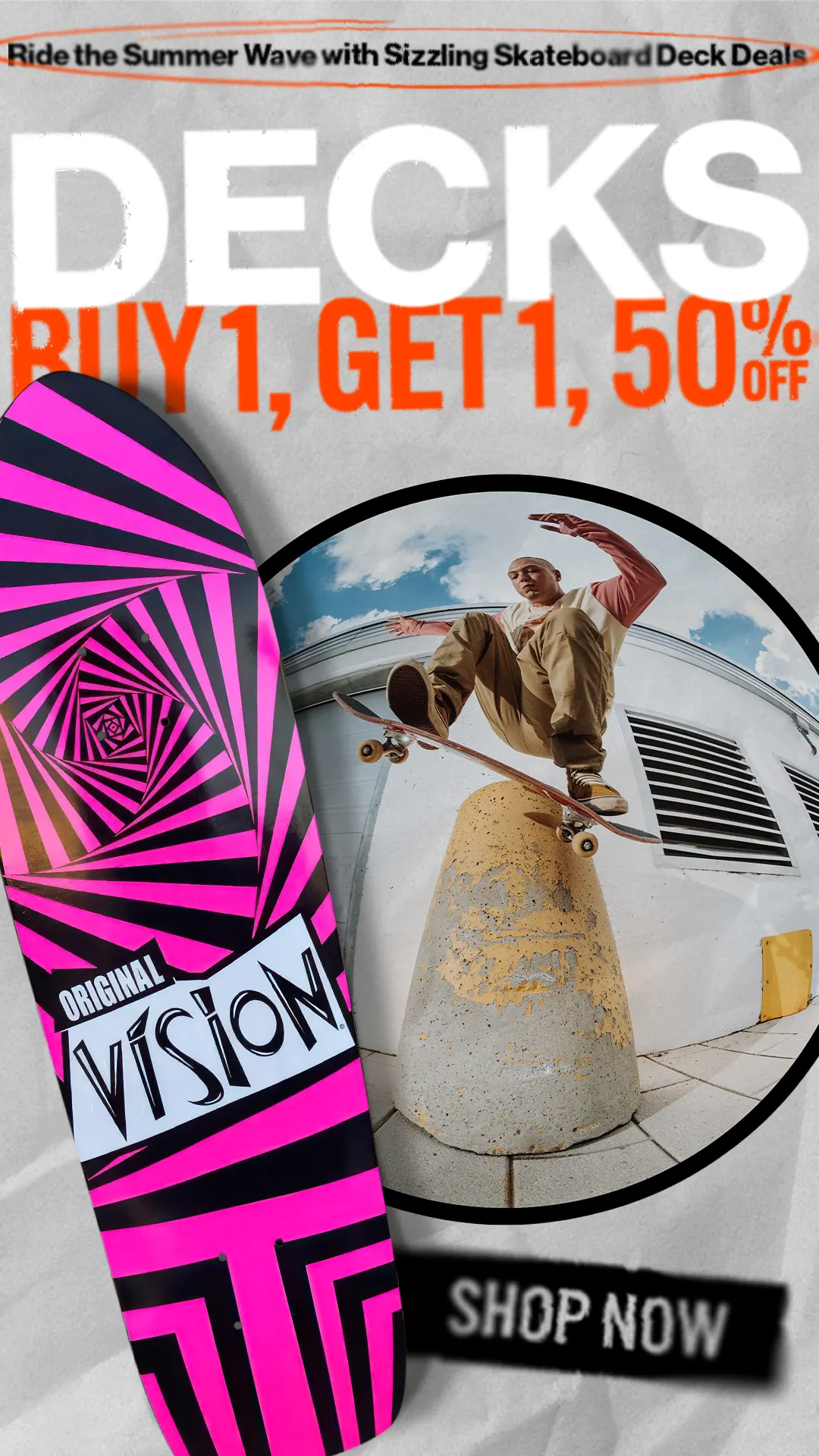
My task was to revive Vision’s identity across all creative touchpoints. I dove into its past—studying its iconic ads, decks, and designs—to bring forward the spirit that once defined it. My goal was to craft a new, cohesive visual language that honored its roots while adapting it for the modern digital space. I brought back its grungy, handmade feel and infused it into everything from the website to the ads and newsletters.
When I stepped in, Vision Street Wear was a patchwork of mismatched styles. With different designers contributing over time, the brand had lost its visual coherence. The look had become overly polished—too clean, too modern—and didn’t reflect the rebellious tone that originally set Vision apart from the crowd.
The challenge was not only to rediscover what made Vision iconic, but to reshape that identity in a way that spoke to today’s audience. I had to study its history—from its inception through its evolution—to understand the core of its appeal. Then came the task of applying this to every medium: web, email, Instagram, Facebook, and YouTube. Each platform required tailored creative—static and motion—designed to feel authentic and unmistakably Vision.
I immersed myself in skate culture. I visited skateparks, attended tournaments across North America, watched footage from other brands, and talked to skaters to better understand what this world looks, feels, and moves like. That research grounded every design choice I made.
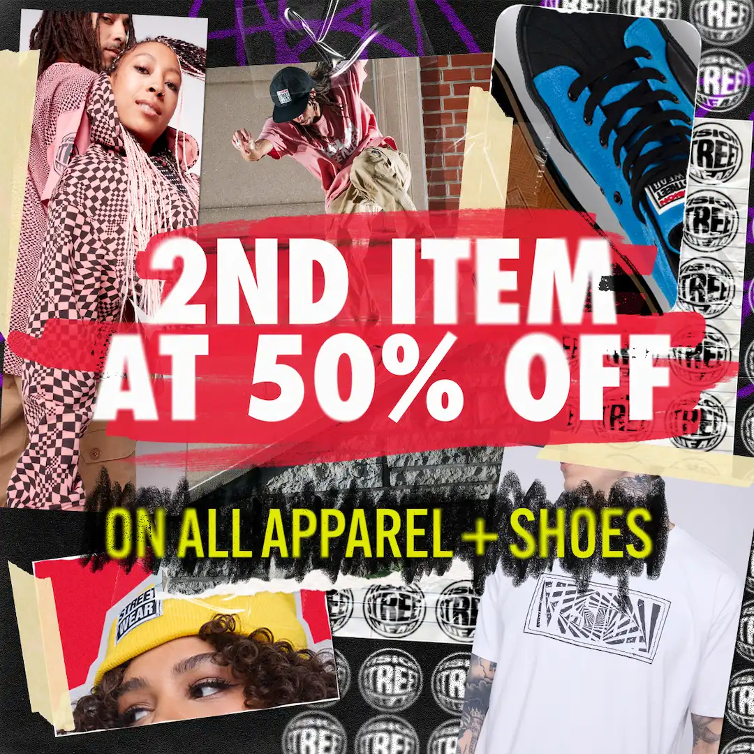
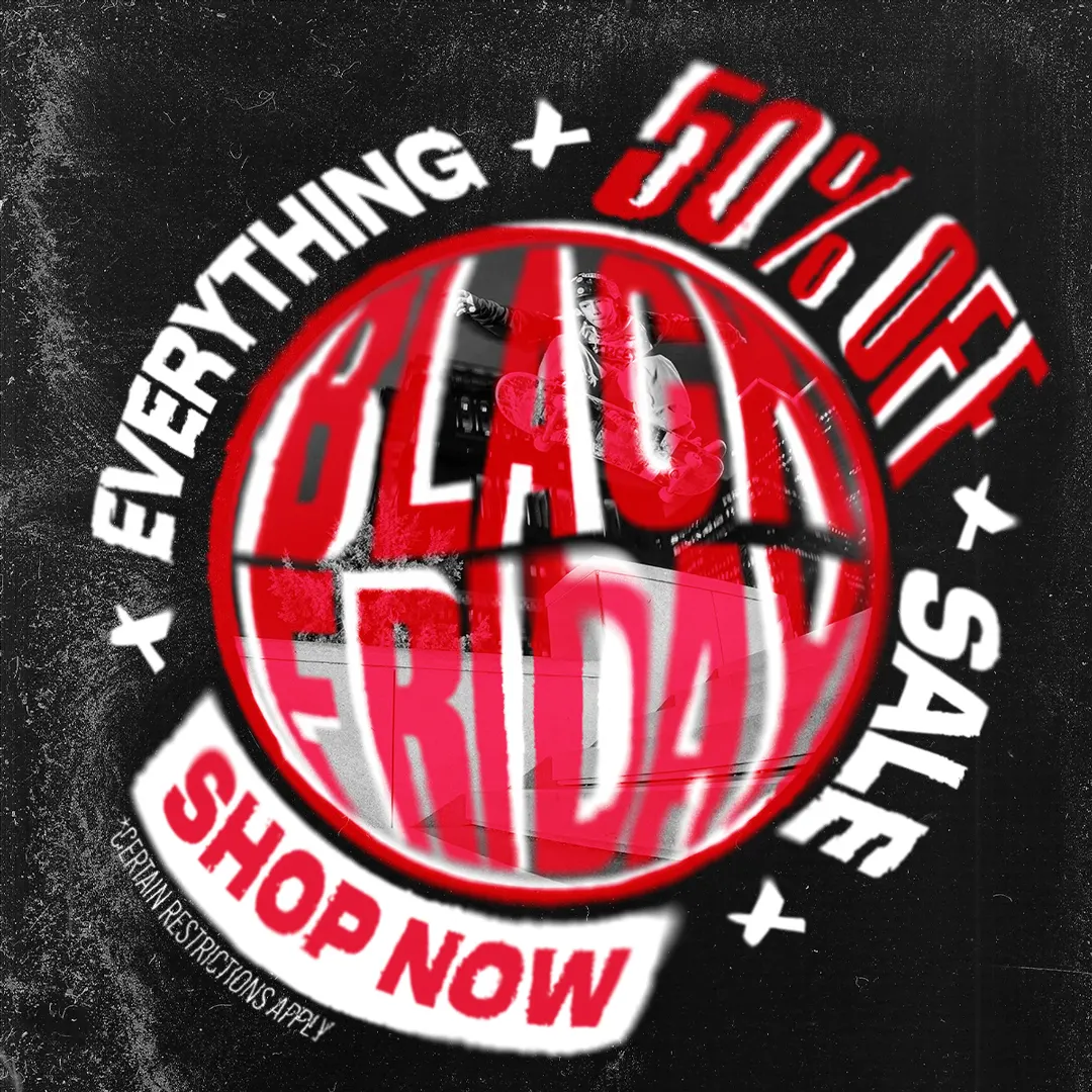
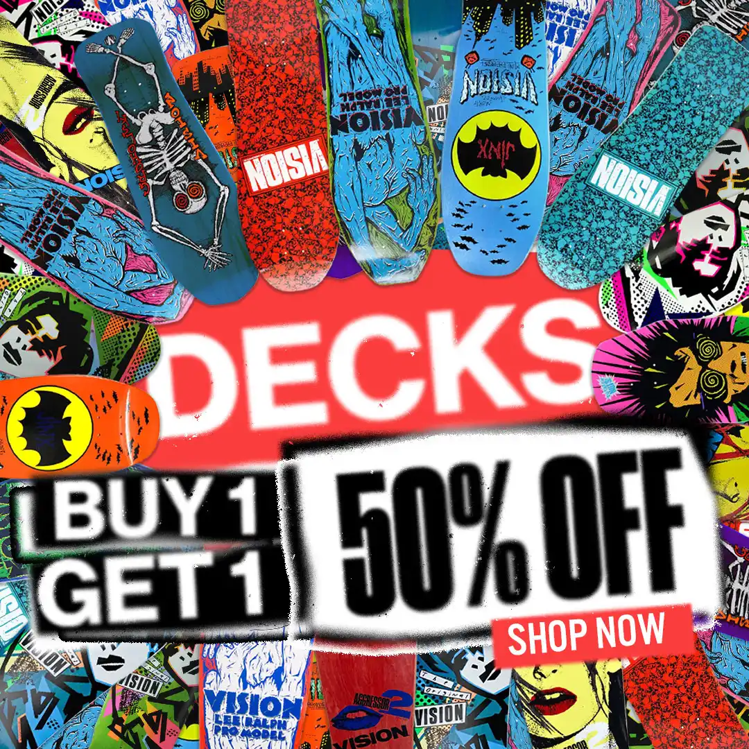
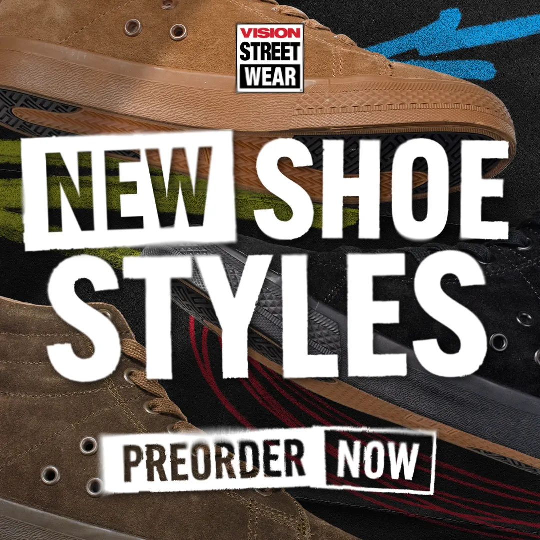
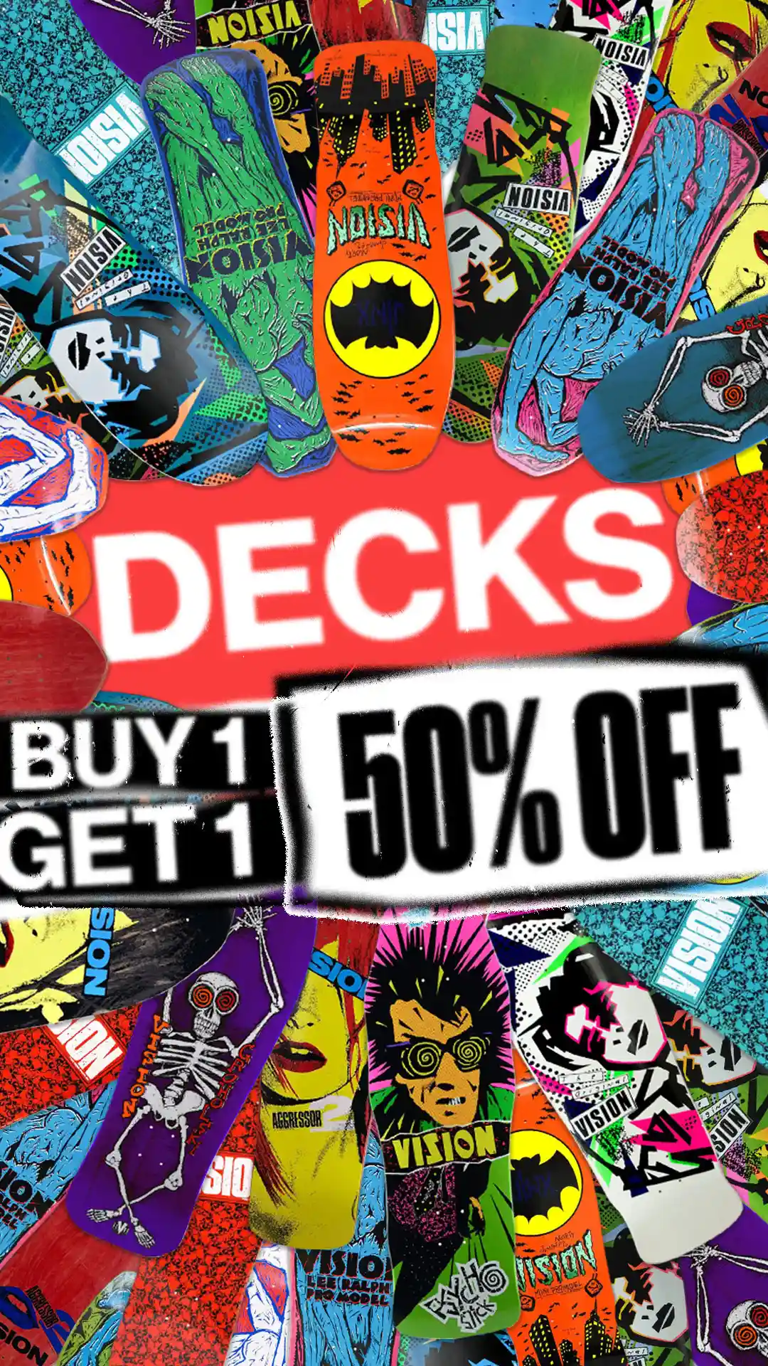
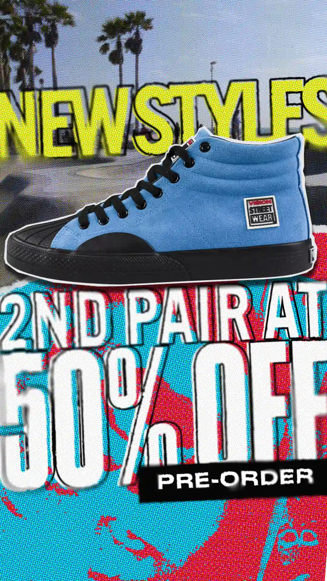
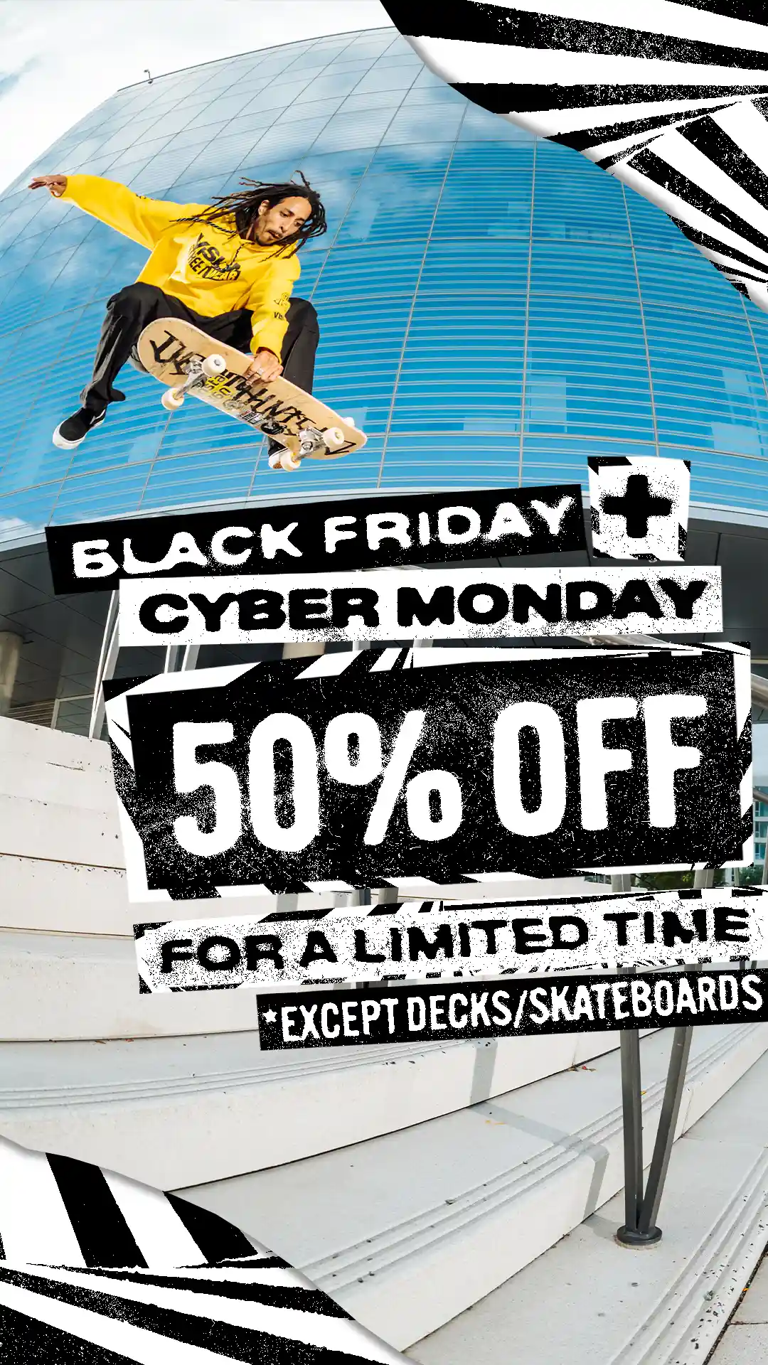
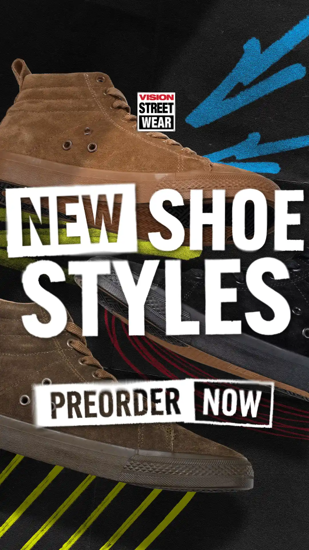
On the web side, I rebuilt the eCommerce site to be clean, responsive, and easy to navigate while maintaining the gritty attitude of the brand. I created dozens of ad variations and newsletters—each with a clear message, strong hierarchy, and fast readability, without sacrificing personality.
Every asset was designed to be more than just a marketing piece—it had to stand on its own as a visual statement, just like a skateboard deck does. The goal wasn’t just sales—it was impact and authenticity.
The results spoke for themselves. Sales increased. Customers responded with excitement, often commenting how “Vision was back.” The refreshed brand reignited nostalgia while giving the company a sharper, more recognizable voice. The creative direction I built has since become the foundation for all future design work, with new designers continuing the system I put in place. Vision now has a distinct identity again—one that finally sets it apart.